Introduction & Discovery.
After some research and site analysis of the Karma car configurator, I was given the task of completely redesigning it. I had the advantage of knowing it thoroughly and accessing analytical results where I was able to obtain information such as: user exit points, sections that generated problems. Here is the result of everything learned about the UX / UI configurator.
After some research and site analysis of the Karma car configurator, I was given the task of completely redesigning it. I had the advantage of knowing it thoroughly and accessing analytical results where I was able to obtain information such as: user exit points, sections that generated problems. Here is the result of everything learned about the UX / UI configurator.
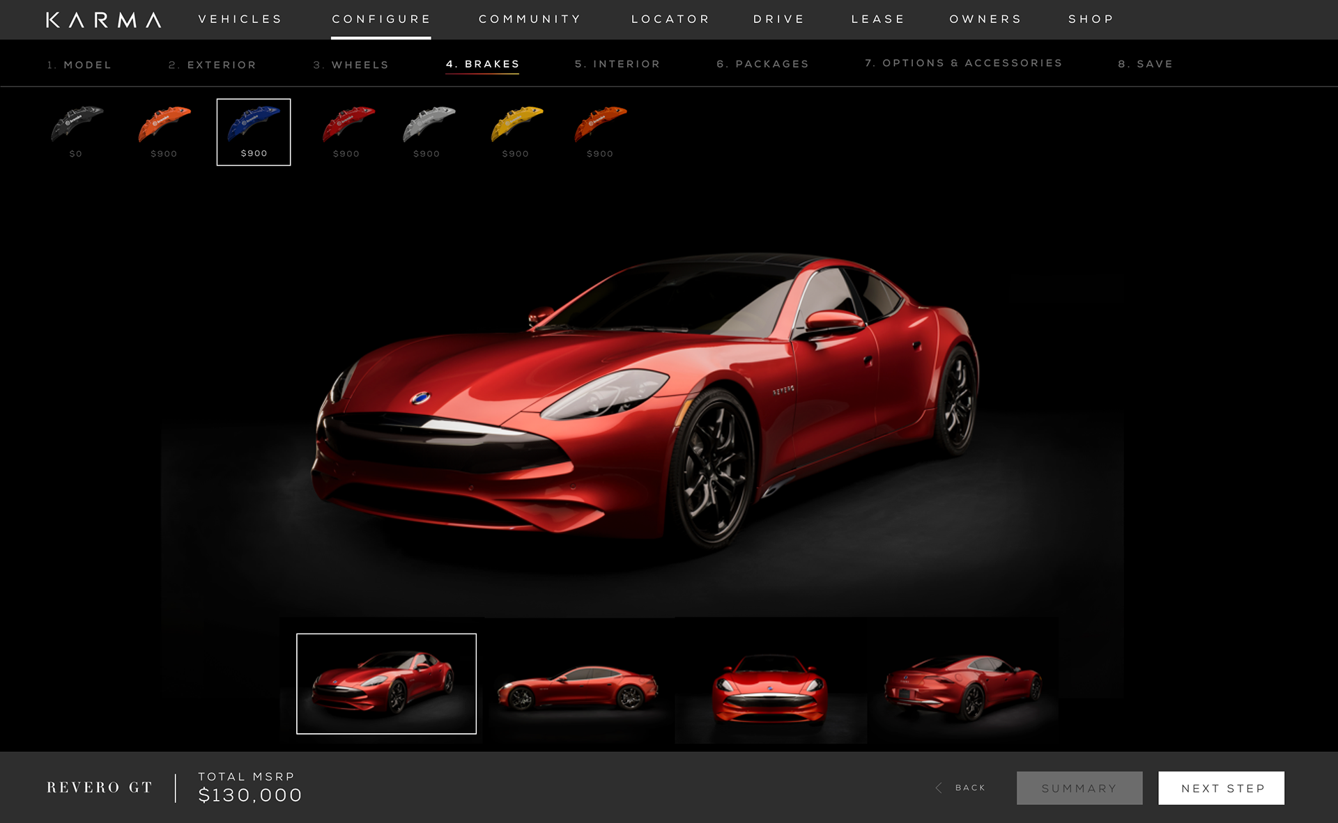
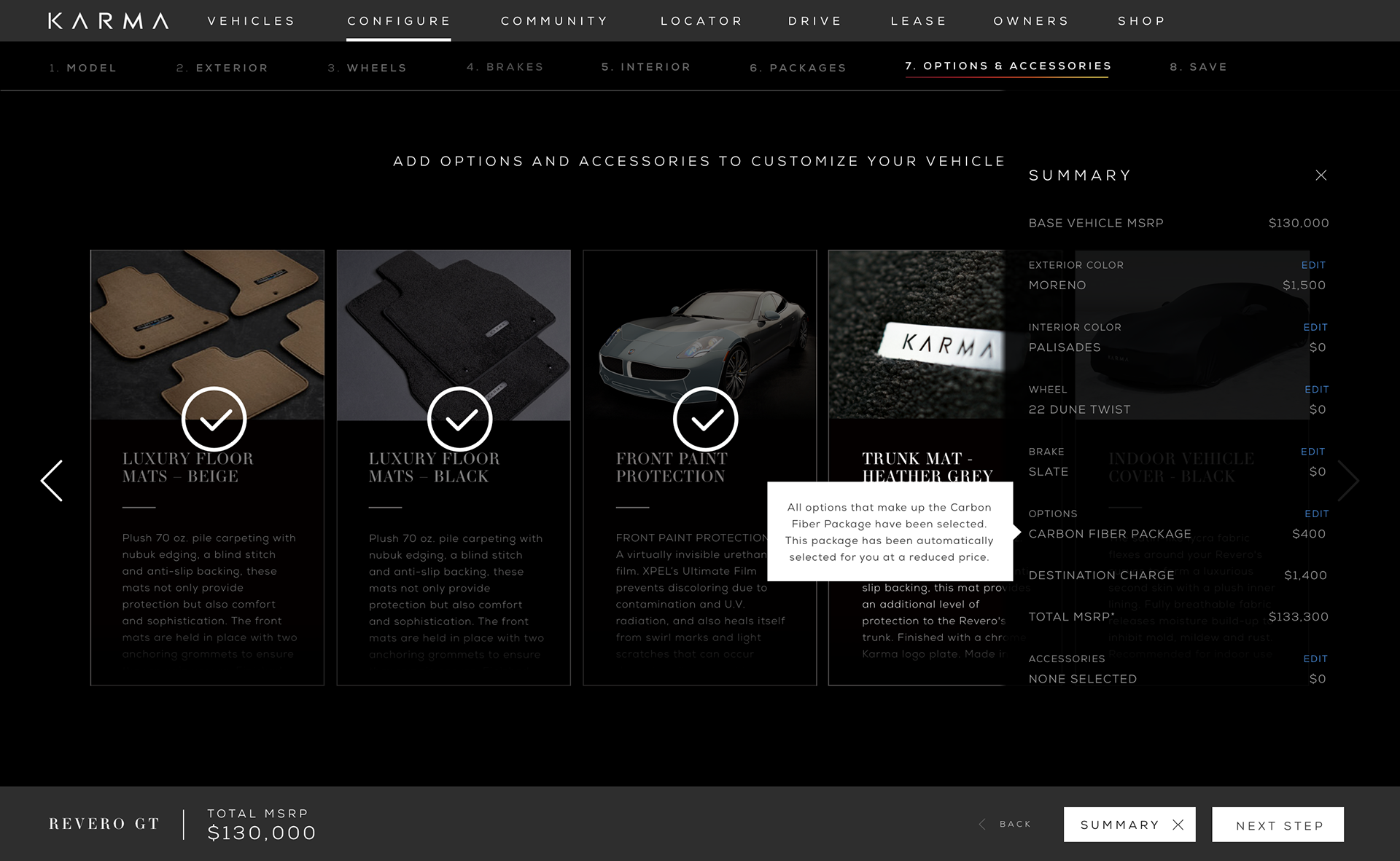
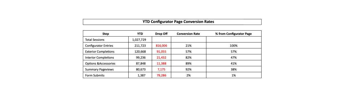
We had noticed that the configurator brought some problems to the users specific to the exterior selection. This was due to the navigation issues and visual cues.
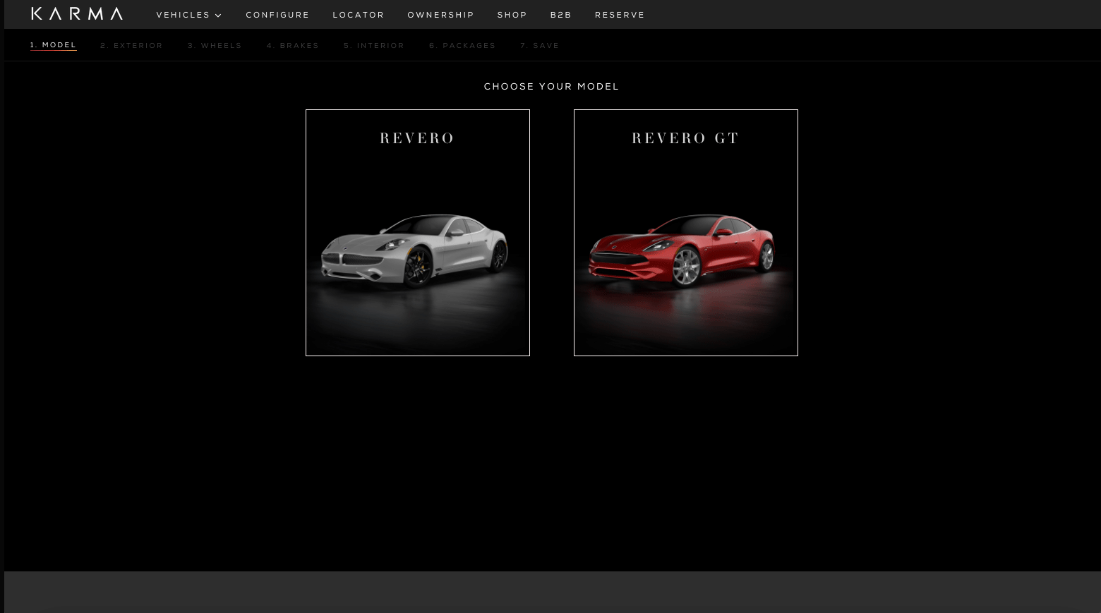
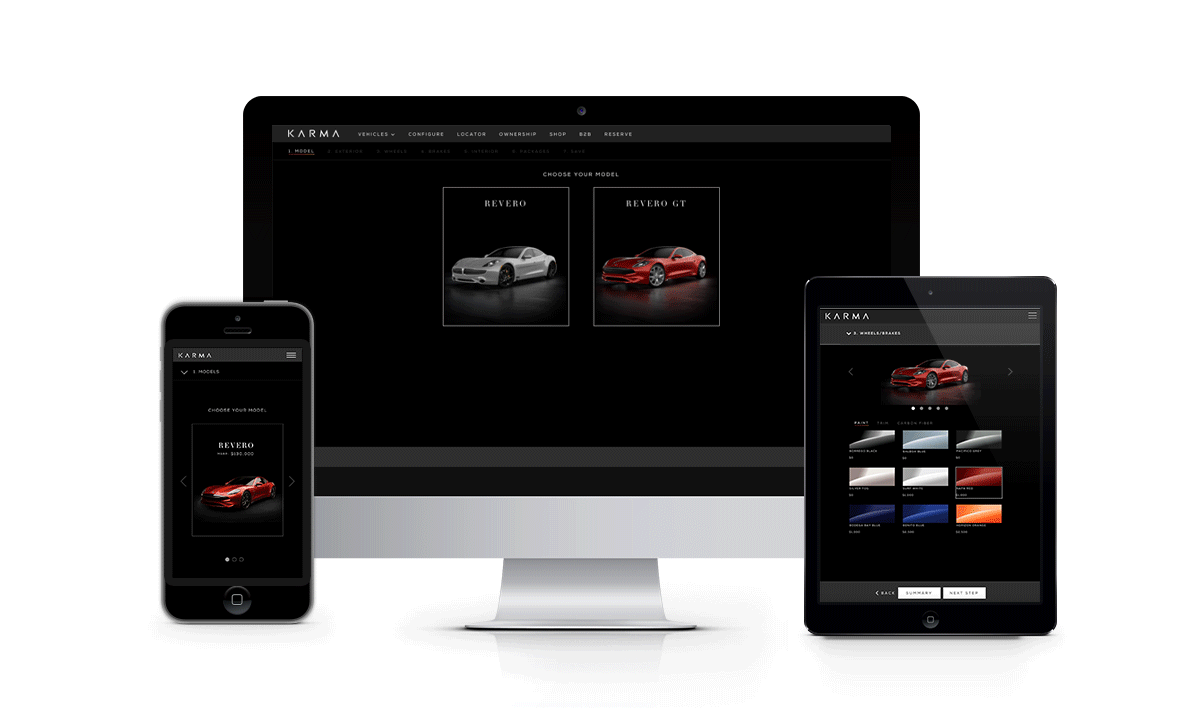
Ease Users into the Configurator.
Configurators can be an overwhelming experience for some users. Easing them into the configurator with simple questions such as selecting a color or model can help set the tone for the configuration experience.
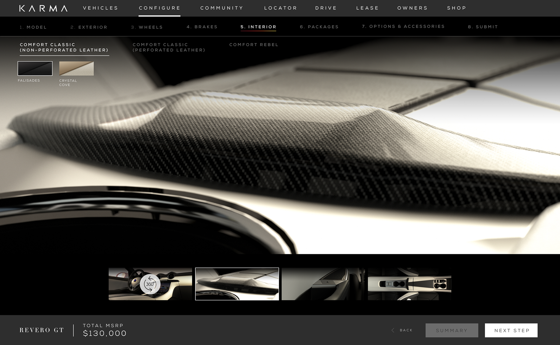
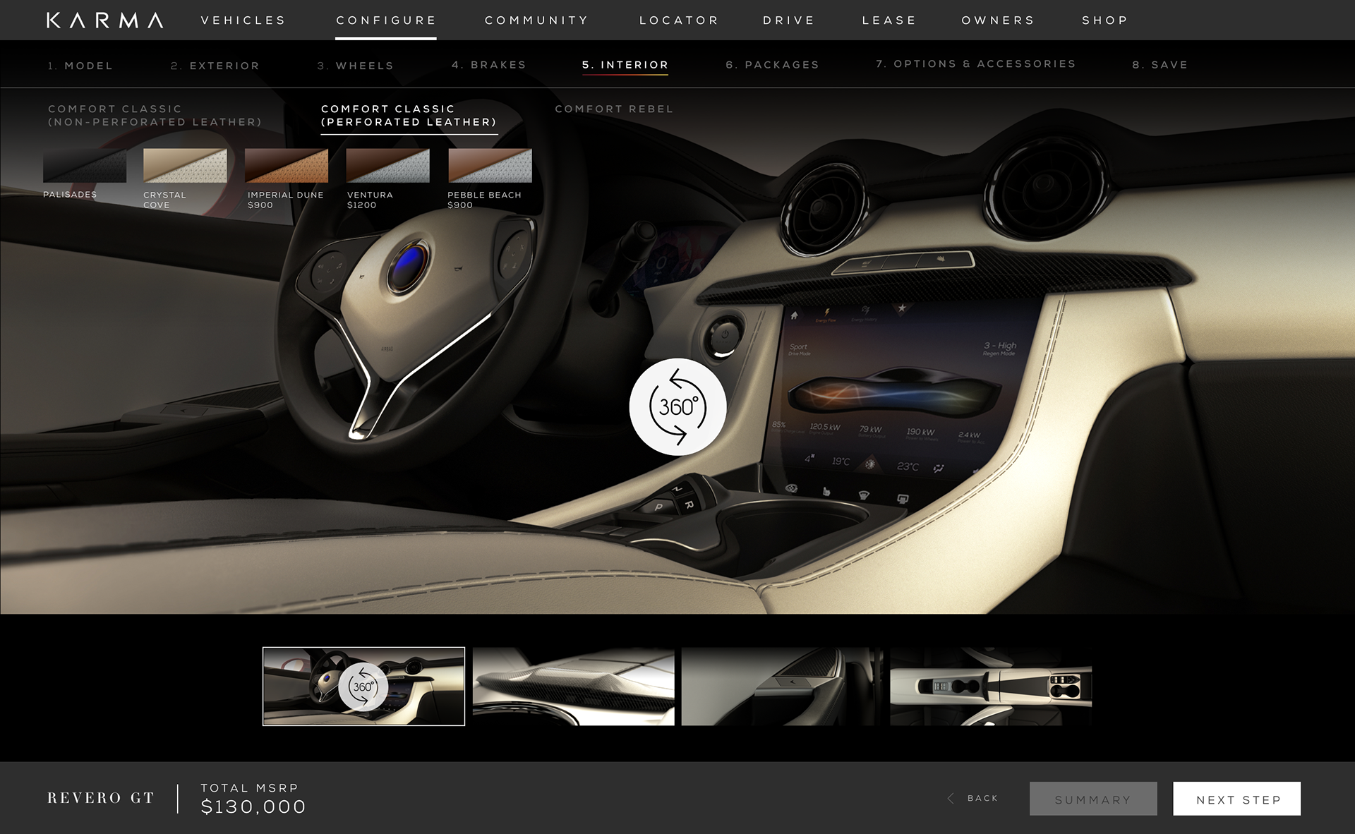
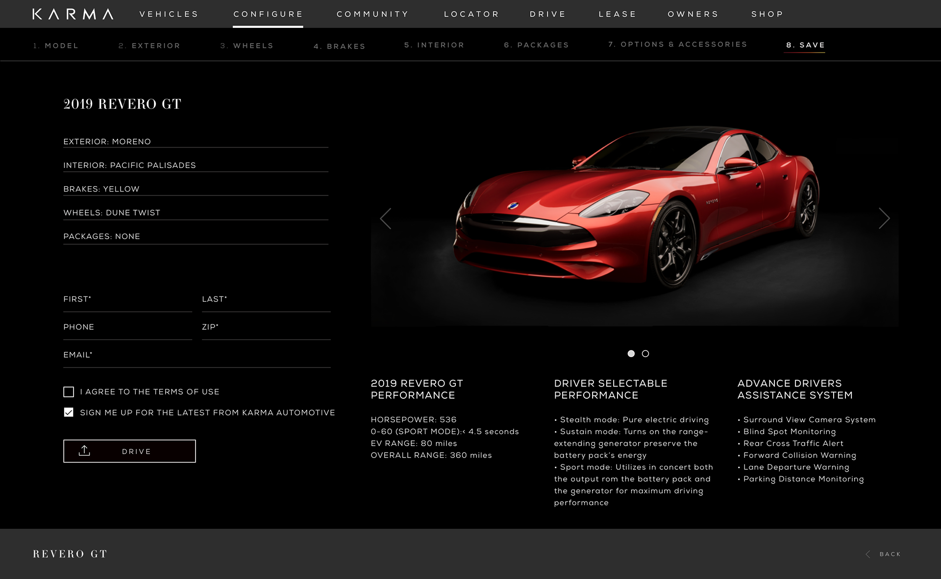
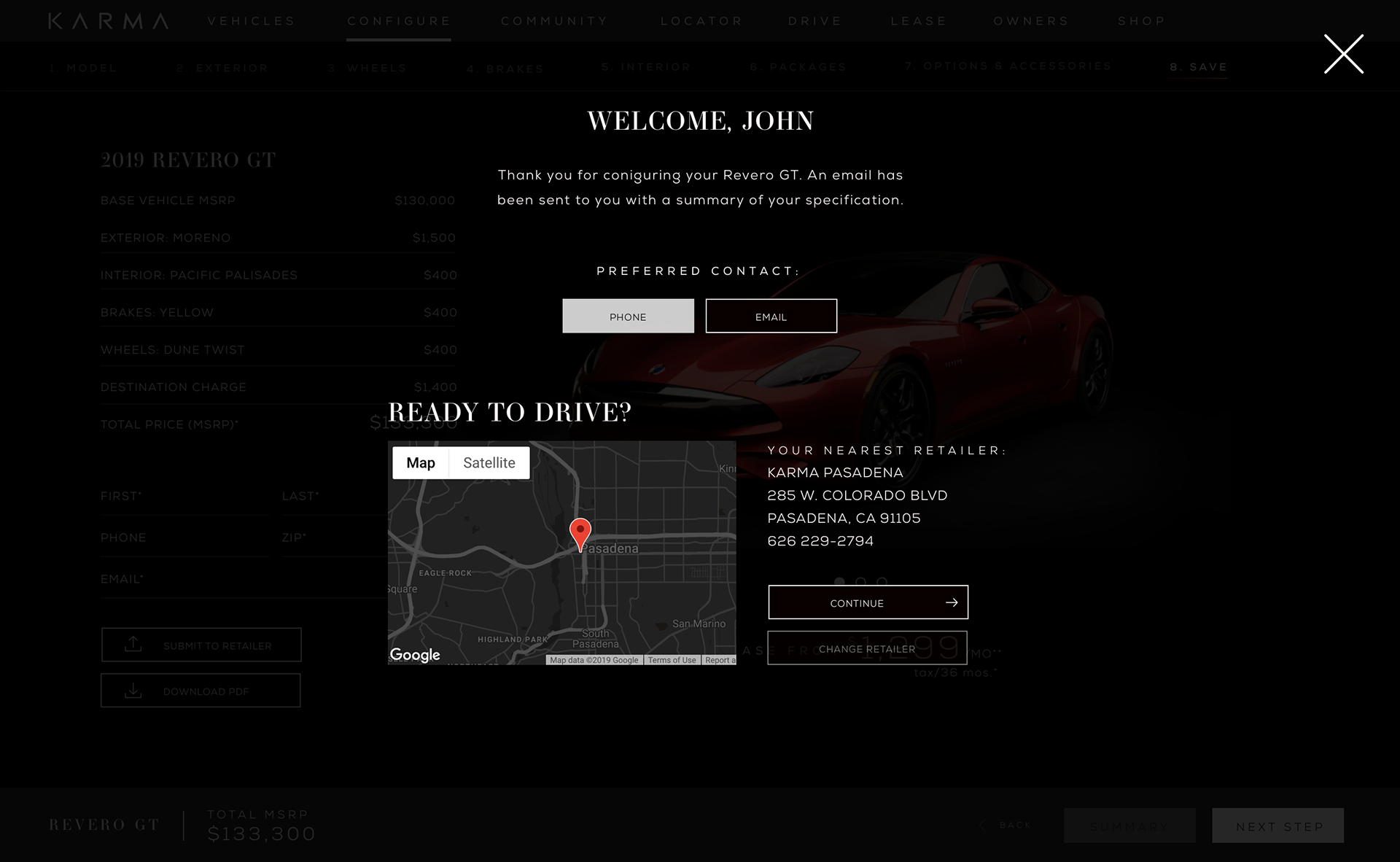
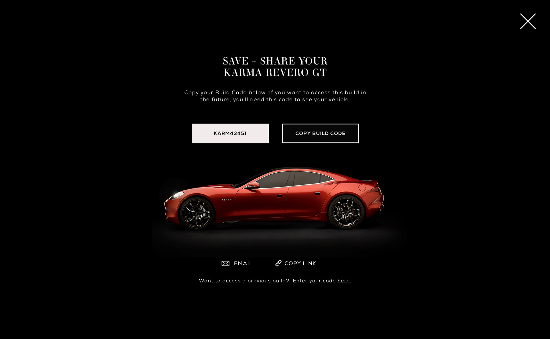
The configurator needed a complete redesign of UI/UX. Added color options for both exterior and interior.
The click through processing was much more linear and intuitive to the previous user experience.
Configurators can be an overwhelming experience for some users. Easing them into the configurator with simple questions such as selecting a color or model can help set the tone for the configuration experience.
The configurator needed a complete redesign of UI/UX. Added color options for both exterior and interior.
The click through processing was much more linear and intuitive to the previous user experience.
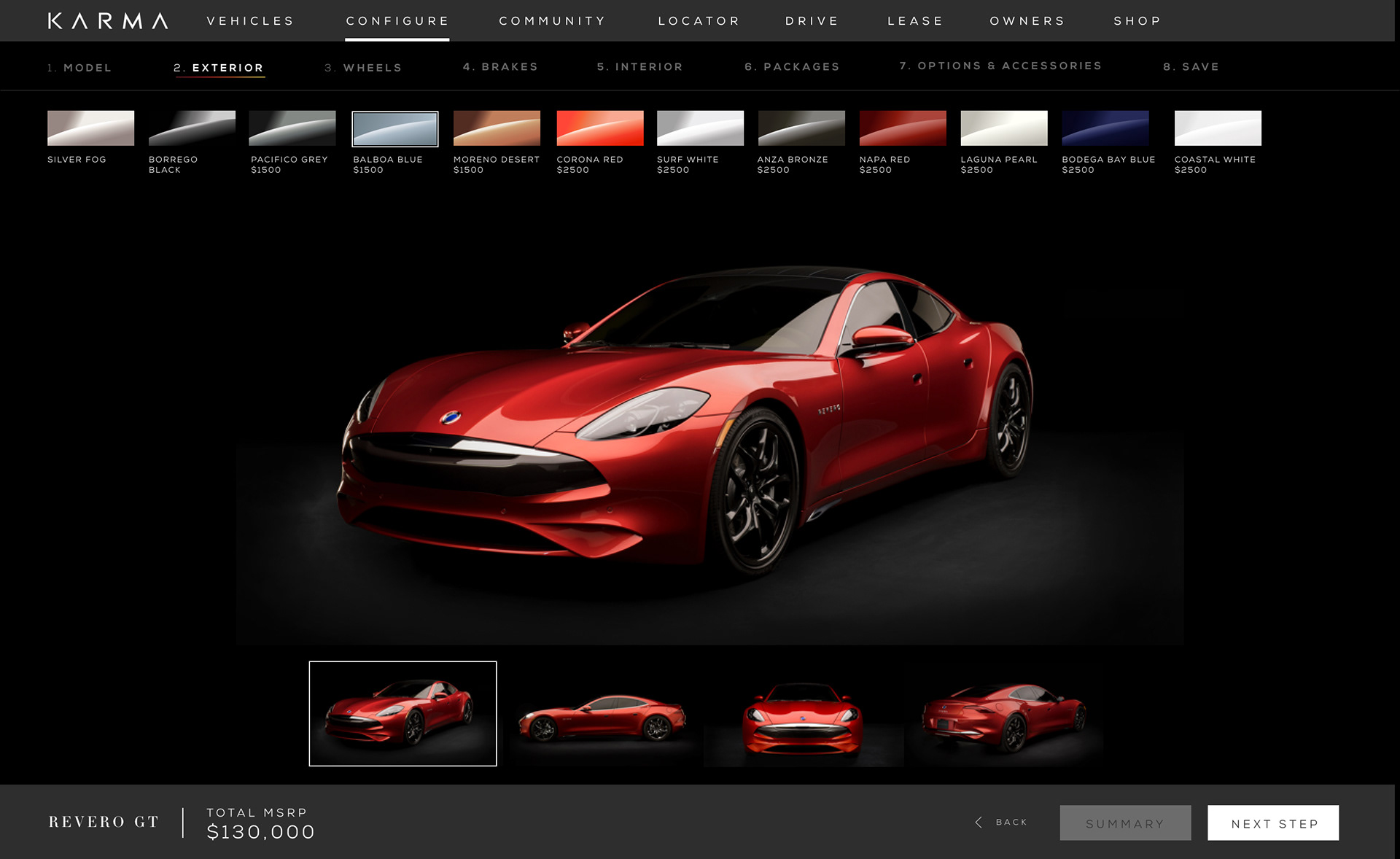
Simplifying the Journey.
Overall this page needed to be simplified. Car images are shown in 4 different point of views displaying different colors options with a highlighted thumbnail image indicated the selected exterior color.
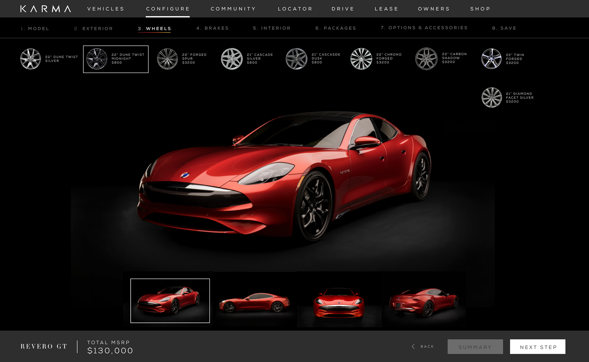
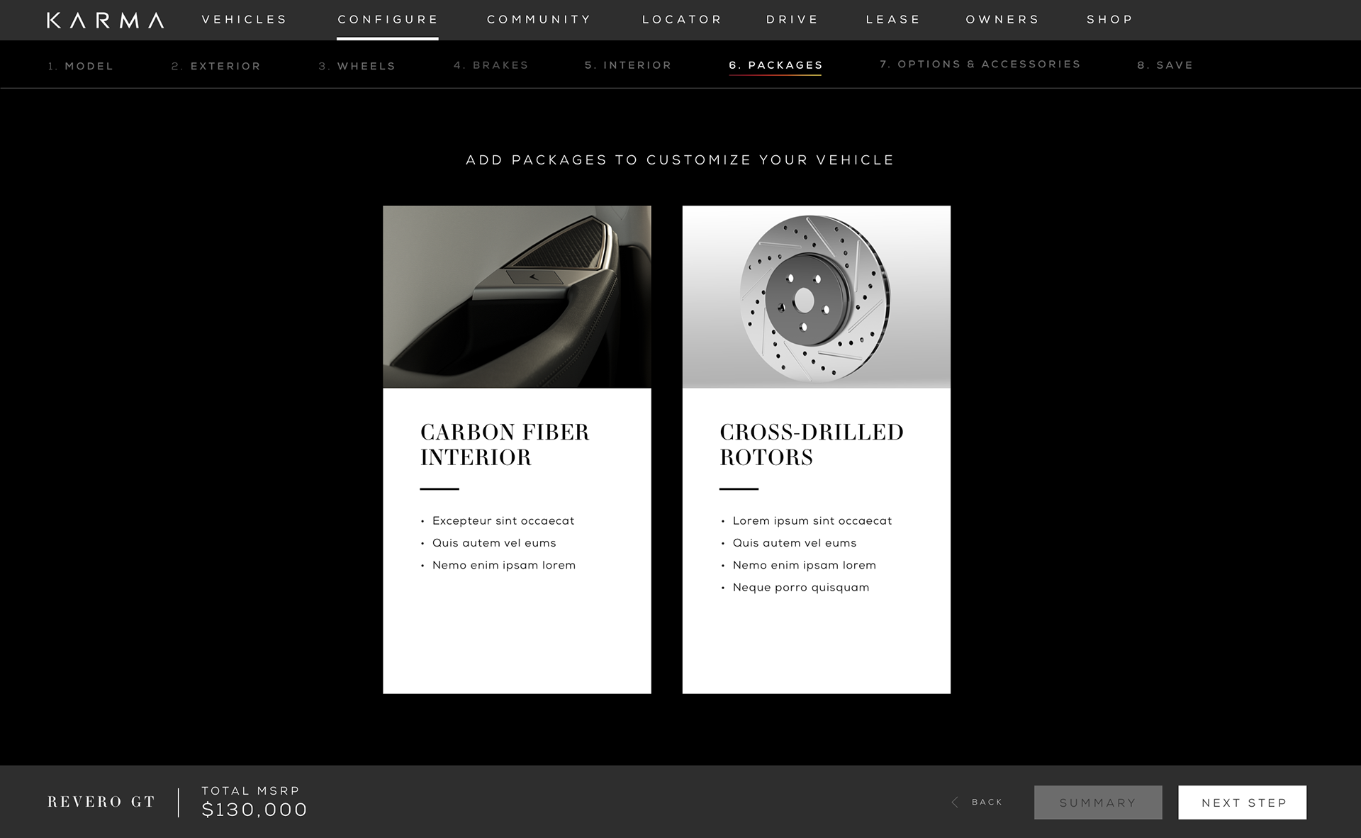
The colors, wheels and brakes options were simplified making the experience more intuitive.