
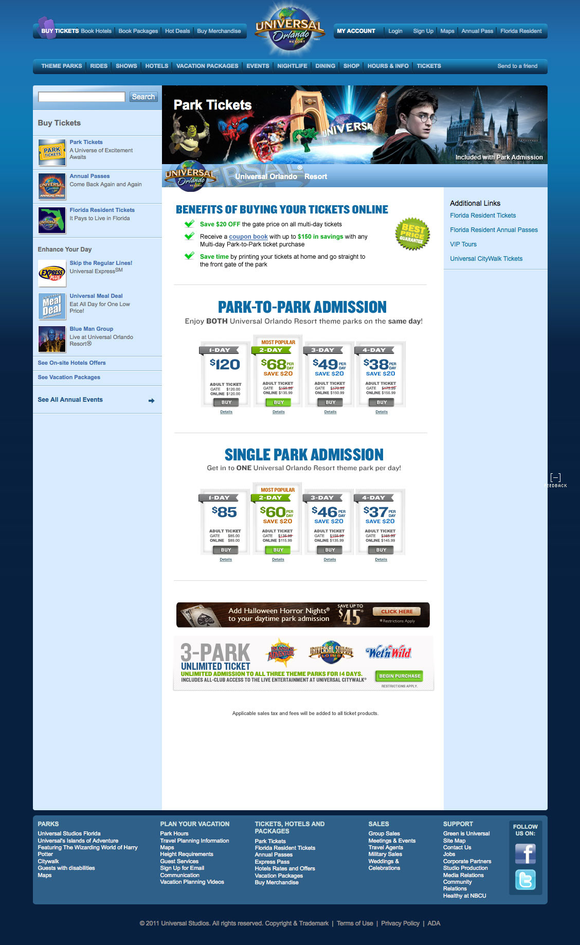
I was tasked with re-designing the theme park ticket pricing pages on Universal Orlando's website. The test consists of 3 different variations of the tickets landing page.
“A,” the control, is the current ticket design and “B,” the treatment, is
a modification that has a goal to improve ticket sales—the “challenger.”
(the control):
Current state of landing page.
a modification that has a goal to improve ticket sales—the “challenger.”
(the control):
Current state of landing page.
Test B (the challenger):
Construct a page that works to simplify the design of the page, while still keeping all of
the benefit messaging.
1) Messaging inclusion that applies to all products on page: Best price guarantee; save time by printing tickets at home.
2) Message inclusion priority for PTP products: Price per day, savings vs gate, coupon on book inclusion, adult price, child price, link to see more details.
3) Message inclusion priority for Base products: Price per day, savings vs gate, adult price,
child price, link to see more details.
Test C:
Mimic design of test B. The only variation is inclusion of adult price strikethrough to illustrate savings of online vs gate. The gate price would have a strikethrough, while the online price would be in close proximity and bold.

Side-by-side comparison from 2011 to 2010.

The current state of Orlando Universal landing page.
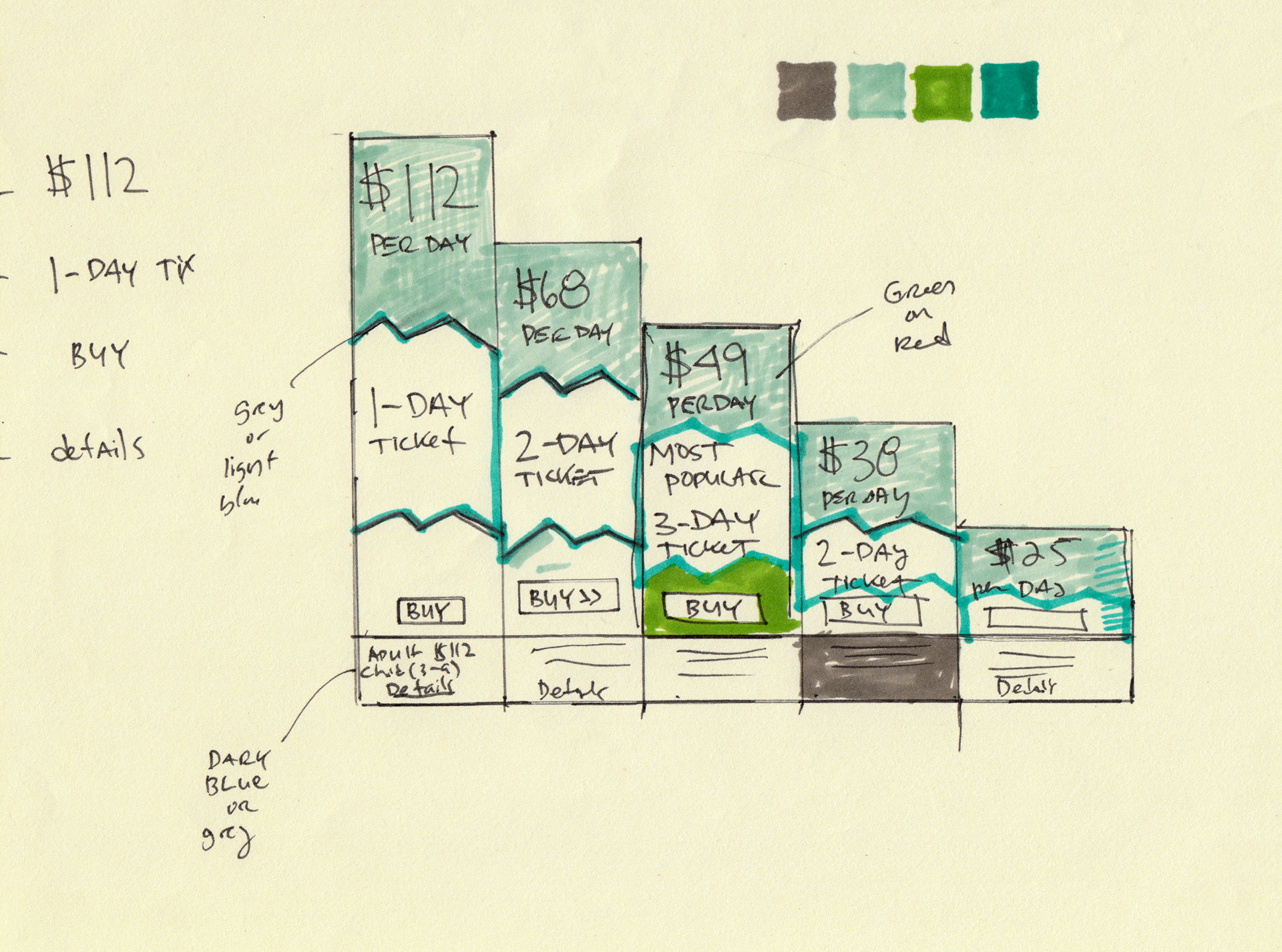
Rough sketch of Park-to-Park bar graph.
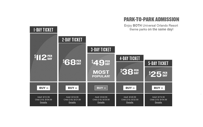
Wireframe of "Park-to-Park" bar graph.
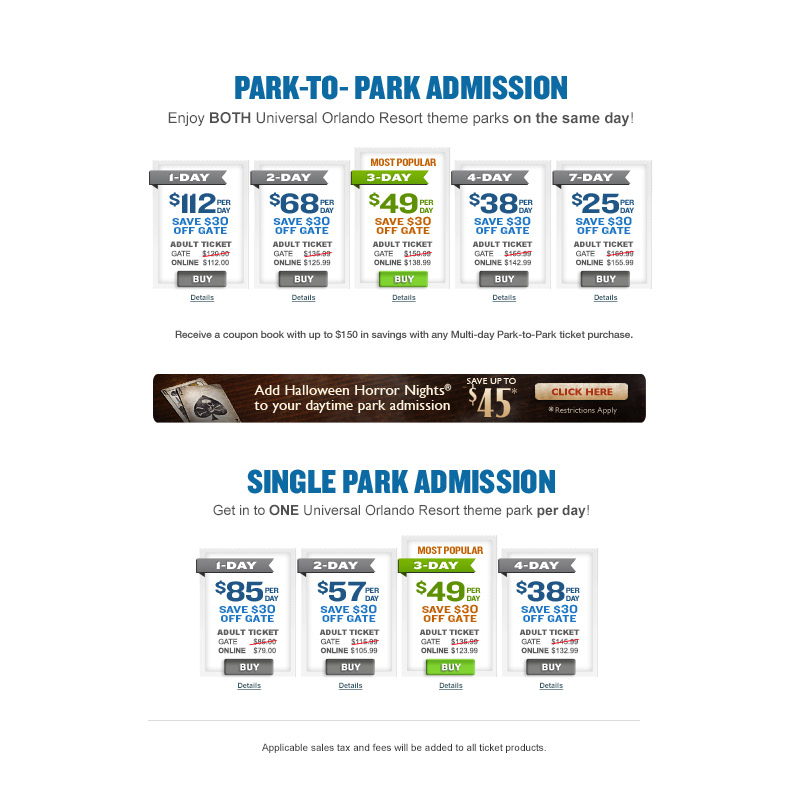
Park-to-Park and Single Park Admission ticket options.
Success is more about getting many small changes right. Some glorify big, disruptive change and ideas,
in reality most progress is achieved by implementing improvements in the small things and in the details
where that tiny change can have the greatest impact.
in reality most progress is achieved by implementing improvements in the small things and in the details
where that tiny change can have the greatest impact.
Result.
The A/B test generated 1.3 million in revenue in the first week alone.